Written by Babs Weber
Sophia Ikura and Design Lab Background
At least 110 design labs across Canada focus on giving the humans at the heart of communities the tools to speak for themselves and change the way complex issues affecting them are treated. These issues are often compounded by deeply held cultural beliefs, entrenched structure around funding models and public policy, and trends in how people tend to behave or act. How might we tease apart the deep seated ideas that contribute to complex problems? Once it’s teased apart, how can we put it back together in a way that helps?
The director of one of these labs, Sophia Ikura of the Health Commons Solutions Lab recently spoke at Strathcona County’s Social Isolation Summit to share some of her work with Alberta based practitioners. One of the projects she discussed was a collaboration with OpenLab tackling high rates of people experiencing overdose from opioids. This collaboration used human centred design to create a project called the Overdose Response Network. She uses the question “The evidence base is thin, can you help us fill it out a bit?” to help put participants and end users at the center of gathering their experiences.
In tackling the opioid crisis, Sophia and OpenLab used a human centred design technique IDEO calls Analogous Inspiration. This technique is about looking for a similar situation to see if there are techniques, processes, structures or inspiration you can apply. Some of the questions used in this technique are…
What’s the process in the issue you are studying?
What other problems have a similar process?
Who has built a structure that works with this process?
How might we adapt and use that structure in our context?
The idea: An App to combat opioid overdoses
In an overdose situation, a person has an acute health emergency requiring immediate lifesaving intervention. OpenLab quotes research that says 80% of people who inject drugs do so alone, and over 60% of people who die of overdose seem to be alone at the time. Evidence shows that quick intervention with the drug naloxone saves lives. In looking for an analogy, the team found that The Netherlands has implemented a system where anyone who has been trained in using publicly available AEDs gets alerts from a smartphone app if a person in the area reports having a heart attack. By getting pre-trained people already on or near the scene involved, this app cuts response time and saves lives.
To adapt this app, the team brought potential participants together to talk about what they would - and would not - feel was useful or safe from an app like this. Users helped suggest features and an intuitive interface. They prototyped designs on paper, encouraged their audience to point out potential issues and solutions, then ran a beta test in East Vancouver along with a naloxone awareness campaign. They gave out window stickers saying, “Knock here, I have Naloxone;” tapping into a 21st century version of the ‘Block Parent’ program in an effort to reduce both stigma-based barriers and issues with access to this life saving drug. It also could potentially create a network of volunteer responders who can connect with people who could use that support.
Sample app screens.
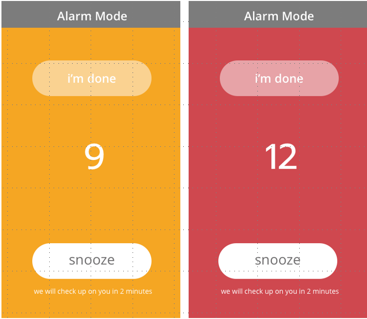
Instead of users of the app choosing to actively send a message (“I’m having a heart attack, here is my location”) the app was designed so users have to actively stop a message from being sent out that sayse “I may be overdosing, here is my location.” To do this, participants open their app before taking a dose and set a timer. If they are alert after they take the does, they press the stop button and the message doesn’t send. If they are in distress and can’t physically hit the stop button, the app automatically sends the alert message. By tapping into the people around them, as well as emergency responders (included after a long conversation with users, whom often worry about criminal charges), people at risk of overdose can reduce the likelihood they will die alone.
Example of the ‘alarm’ screen.
It will take more than an app to untangle all the factors and barriers leading to people dying of opioid use - but an app like this could get help to people when they really need it. As a step towards reducing extended response time, this is a really interesting example of what happens when public health policy makers step beyond just data to talk directly to the people most affected by an issue. When we acknowledge that data collection doesn’t give us the full picture, and ask Sophie Ikura’s question - “the evidence is thin, can you help us fill it out a bit?” The inspiration for a few more tools in our collective toolbox pops out.
Where’s this app at right now?
Sophia and the team are still in the prototyping design phase and are looking for the right partnerships to help them make this app a reality. If you think you could be part of this pan-Canadian effort to make this app a reality, she would love to hear from you! Click here to email her.
More Information
For more information on the Health Commons Solutions Lab, you can visit their website here.
To learn more about analogous inspiration, see examples from IDEO here.
If you’d like to speak to OpenLab about participating in their beta testing, contact them here.
To explore more of the design labs working in and around Alberta and connect to one near you, visit the Social Innovation Lab tab of the ABSI Connect resource library.
To learn more about human-centred design practices and organizations using this principle well visit the Human-Centred Design tab of the ABSI Connect resource library.
ABSI Connect’s blog features examples, learnings, and reflections related to social innovation, human-centred design, and systems change in Alberta. Do you have a story, idea, or insight you’d like to share with the ABSI Connect community? Let us know.


